Last updated: May 2026
Most eCommerce revenue we see lost is lost in the gap between intent and purchase — not to bad products, not to bad traffic. A seamless eCommerce journey closes that gap: a customer moves from landing page to completed purchase without hitting friction. No confusing navigation, no slow-loading product pages, no surprise checkout steps, and no missing trust signals when they're needed. Here's the nine areas of the eCommerce customer journey and what "seamless" looks like in practice for each one.
The nine areas where eCommerce journeys make or break sales:
Picture this. You have a beautifully designed website — polished and on-brand. It runs like a dream. Even your SEO is on point, so your landing pages have a healthy stream of new visitors. Then they arrive at your store. The design is different. The payment portal redirects to something that doesn't look or feel like the site they've been using. The product pages take forever to load, the categories are unclear, and worse yet, there are about a hundred fields they have to fill in before they can complete a purchase. In just a few seconds — or a few clicks — you've lost them. All the goodwill that the rest of your site has earned has gone to waste.
Just like the event horizon of a black hole, this kind of customer frustration is easy to avoid but nearly impossible to recover from. Your eCommerce store has seconds to capture attention and convert visitors into buyers. If the experience is confusing, frustrating, or disconnected from the rest of your site, you risk losing sales.
Here are nine tips to ensure your customers have a seamless, user-friendly journey from arrival to checkout.
If your customers wanted a puzzle, they'd do the daily Wordle. Your site needs to make navigation a little simpler.
Whether users are looking for something specific or have arrived knowing only the basics about your business, finding the information they want — and figuring out how to get there — should be a frictionless process. The platform you build on matters too. Our companion post on the platform your journey runs on walks through what each of the major options does well and where the limits are.
When planning navigation on your site:
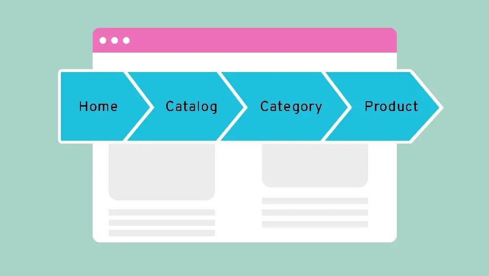
Not sure where to start? Dig into your customer personas and figure out their journey on the site. Once you know what they want, you'll understand how to organize the information. If you do the job right, customers should be able to get around without thinking at all.
Nothing brings a customer's enthusiasm crashing down to earth faster than technical issues on your eCommerce site. Pages that take forever to load. Unresponsive scrolling or laggy image carousels. A checkout page that takes twice as long as it should to finalise a purchase. Whatever the quality of your brand, issues like these make your store feel cheap and unreliable.
To help make every product page run like a dream:
Did you know that around 68% of 2024's online sales were attributed to users on their phones?

If your store is built beautifully for desktops but is a nightmare of swiping, resizing, and hard-to-tap links on mobile, you're abandoning customers — and a huge chunk of your potential sales.
Just as importantly, the Aesthetic-Usability Effect tells us that the better your site looks, the higher users perceive its quality to be — which affects everything in its orbit. Your store, your brand, and your products all benefit from a site that looks good on any device. We've seen this play out across dozens of client builds: invest in mobile, and the desktop conversion rate often climbs in parallel because the brand feels sharper across the board.
Make sure to:
Once a customer has decided to buy, there should be as few obstacles as possible between them and the final sale.

Every new bit of information you ask for, and every extra action they have to take, makes it a little more likely that they'll get frustrated, second-guess their decision, or find some other reason to rocket away from your site.
Make sure you:
If you're looking for more (a newsletter sign-up, a loyalty signup), don't make it a mandatory part of the process — and offer an incentive for customers who complete those extra steps. Already have their email? When they abandon a product in their cart, that's the perfect opportunity to send a reminder or personalised offer to entice them back. Which leads us directly into our next tip.
Personalisation is one of Major Tom's top tips for building a captivating website. Whether you're selling wine, hosting events, or just trying to get customers to return, people want an online experience tailored to their wants and needs.
To do that, be sure to:
And remember: while winning a purchase might be your main goal, a customer's journey doesn't end at the checkout. You should have a plan for what comes next and what can bring them back to your store.
Every customer starts out as a stranger to your brand. You need to show them what you have to offer, but you also need to earn their trust.
Polished design that aligns with your brand goes a long way toward a store that looks trustworthy and professional. There are also a few specific steps you can take to make customers feel safer opening their digital wallet.
To make users more confident about their purchases:
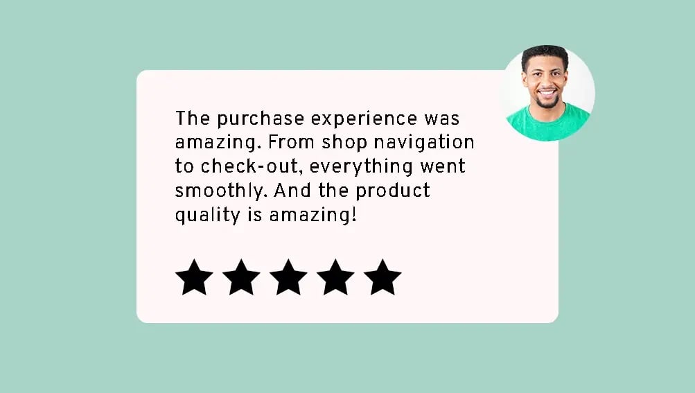
One thing we find consistently effective in our client work: trust signals matter most at the moments of highest hesitation — the product detail page, the cart, and the final checkout step. Concentrate the proof there, and the conversion impact is bigger than spreading it evenly across the site.
Your site's product pages should be a showcase for whatever you're selling — making them look and sound their best while providing whatever information a customer might need to know in order to buy.
To make every product page shine:
While you're at it, ensure your product images have effective alt text. Accessible design removes barriers, supports conversions, and even helps your SEO efforts — bringing more customers to your store. We see UX foundations like this matter even more for high-traffic stores, where the smallest gaps compound. Our piece on why eCommerce success depends on user experience is the right deep-read here.
While it's easy to focus on winning new sales, convincing current customers to stick around (or make another purchase) is more cost-effective than bringing in brand-new business.

But that won't happen if you take those customers for granted. A few easy incentives through your store can make a big difference:
As just one example, Shopify has a host of ready-made integrations to help you deliver these features. On WordPress, the right developers can help you implement a host of competitive, flexible options. And remember: incentivising reviews and testimonials is a great way to turn these repeat customers into powerful advocates for your business.
Even the best sites need ongoing attention to keep working at their best — and investing in the right analytics tools helps you better understand which parts need improvement.
At Major Tom, we believe that putting data before intuition produces the best results. To do that, you need the right data. Paired with customer feedback and smart analysis, this kind of ongoing attention will help you maintain a modern, competitive store for years.
Be sure to:
It's all part of making sure that your site is marketable, up to date, and being the best possible advocate for your business.
A customer's every click, scroll, and search in your store should feel like part of a well-planned journey that sees them safely to their destination: the checkout.
If you're looking for an experienced partner to help you plot the route from arrival to purchase, our crew at Major Tom can find clarity in the chaos of eCommerce experience design. Take a look at our eCommerce development services, or contact us today to talk about where the next improvement should land.
Start with the actual data you have: site analytics, customer surveys, support tickets, and post-purchase feedback. Map the touchpoints from first awareness through repeat purchase, with specific friction points called out at each stage. Most useful customer-journey maps fit on one page and name the systems and content that own each stage. The map isn't the goal — the goal is finding the next change that improves how customers actually move through it.
Use the nine areas in this post as your audit framework: navigation, performance, mobile, checkout, personalisation, trust, product pages, retention, and ongoing support. Most stores have one or two of those that are genuinely weak. Fix the weakest first — the impact compounds because the journey only feels seamless when every step works. We find clients see the biggest gains in checkout and mobile first.
A seamless checkout is short, transparent on cost, supports guest checkout and the payment methods your customers actually use, and shows a clear progress indicator at every step. Surface all costs (including shipping) on the cart page, not at the final step. Pre-fill where you can, autocomplete addresses, and skip required account creation. Three steps or fewer is the practical target.
Mobile now drives roughly 68% of eCommerce sales. Stores built for desktop with mobile as an afterthought lose conversion at every step of the journey: navigation that doesn't fit, buttons that are hard to tap, checkouts that don't autofill. Responsive design that adjusts for screen size is the floor. The brands that win on mobile design for thumb reach and short attention spans first, then scale up to larger screens.
Reviews and testimonials on product pages, secure-payment badges at checkout, clear shipping and return policies, visible customer service contact, and a transparent privacy policy. Trust signals matter most at the moments of highest hesitation: the product detail page, the cart, and the final checkout step. Concentrate the proof at those points rather than spreading it evenly across the site.
Three changes usually drive the biggest gains: invest in professional product photography (and video where relevant), write descriptions from the customer's perspective rather than the brand's, and surface reviews prominently. Beyond that, make sure every product page has a clear price, a clear add-to-cart button, and any context the customer needs to feel confident — shipping cost, return policy, stock status, and complementary products.
An eCommerce retention strategy is the deliberate work of bringing existing customers back for more purchases. It typically combines email and SMS nurture sequences, a loyalty program, post-purchase content that adds value (recipes, styling tips, how-to videos), and incentives like early access or exclusive discounts. Retention pays back faster than acquisition for most stores — repeat customers convert at higher rates, spend more, and require less marketing investment per order.
Websites should look good from the inside and out.